
Before most people knew the plot of Marty Supreme, they knew the color. Loud, punchy, and impossible to miss, a very specific shade of orange has followed Timothée Chalamet from red carpets to press appearances—becoming an unlikely calling card for the film and its marketing machine.
The moment that cemented the hue came at the Los Angeles premiere on December 8, when Chalamet and Kylie Jenner arrived in matching custom leather looks by Chrome Hearts, both rendered in a high-voltage tangerine. The outfits were coordinated, intentional, and unmistakably deliberate. Even casual onlookers clocked it instantly.
A Color With a Narrative Purpose
The shade is not arbitrary. Marty Supreme centers on fictional professional table tennis phenom Marty Mauser, and the orange is a direct reference to ping-pong balls—specifically Mauser’s decision in the film to swap traditional white balls for orange ones to increase visibility. Visibility, it turns out, is the point on and off screen.
Chalamet has leaned into the symbolism fully. At another appearance, he wore an orange double-breasted suit with a fringed scarf from Tom Ford, designed by Haider Ackermann, while his mother, Nicole Flender, matched him in the exact same shade. Even his co-star Gwyneth Paltrow swapped her signature quiet-luxury uniform for an orange satin tracksuit during a late-night appearance.
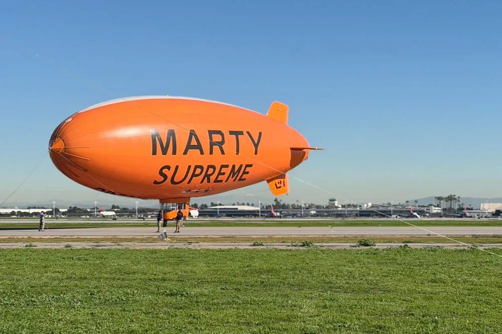
A24, never subtle, pushed the concept further: an orange blimp floating over California, promotional visuals drenched in the color, and even a novelty cereal box featuring Chalamet’s character—again, in orange.
Method Dressing, But Make It Branding
This is not Chalamet’s first foray into method dressing. His press tours often blur the line between costume, character study, and personal style. For A Complete Unknown, he dressed like Bob Dylan. For Challengers, tennis aesthetics dominated the red carpet via Zendaya’s looks. What makes Marty Supreme Orange different is its simplicity.
Instead of translating character through silhouettes, props, or references, the entire narrative is distilled into a single visual cue: color.
In a satirical video released by A24, Chalamet jokingly pitches “owning orange” as the film’s primary marketing goal—specifying not just orange, but “hardcore orange.” The joke works because it is already happening.
A Proven Formula in Pop Culture
Color ownership is nothing new. Fashion and entertainment have relied on it for decades. Margot Robbie’s press tour for Barbie turned hot pink into a cultural phenomenon. Wicked used character-specific palettes—pink for Glinda, green and black for Elphaba—worn consistently by Ariana Grande and Cynthia Erivo.
Luxury brands have done the same: Bottega Veneta with its signature green, Valentino with PP Pink, Tiffany & Co. with its unmistakable blue, and Hermès with that instantly recognizable orange box.
Color is fast. It cuts through noise. It communicates before context.
Why It Works—and Why It Polarizes
In an era of visual overload, a single saturated color is one of the quickest ways to signal meaning. You do not need a caption, a press release, or an explainer. You see the orange, and you know what it’s attached to.
That efficiency is also what makes it divisive. Some audiences are fatigued by overt method dressing and hyper-visible marketing. Marty Supreme Orange is not subtle. It is loud by design. Whether viewers see it as clever or exhausting likely depends on how much they enjoy being in on the joke.
The Final Question
Will people show up to theaters in tangerine? Will the color outlive the press tour? Will orange now mean Marty Supreme the way pink means Barbie?
That remains to be seen. The film already has strong reviews and a stacked cast, so the color may not need to do much heavy lifting. Still, one thing is certain: long after the details blur, people will remember the orange.
And in modern movie marketing, that might be the entire point.